Service First Victory Fund Branding
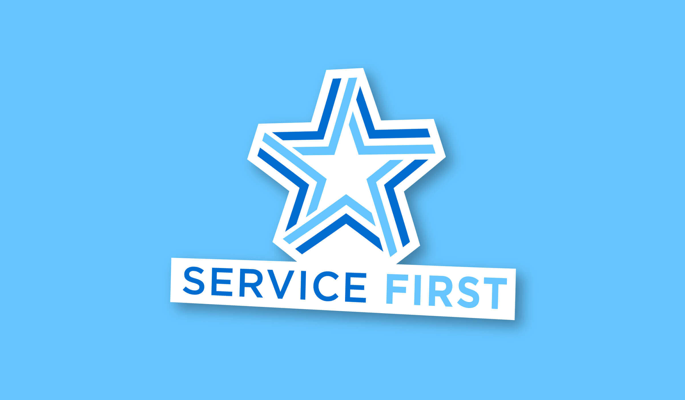
Our design lab worked to create a multi-purpose, responsive logo for the Service First Victory Fund PAC.

With service, youth, and leadership being hallmarks of the PAC the creative team homed in on those ideas, allowing them to dictate color, iconography, messaging, and more.

The first step in any branding / logo project is exploration. Starting with identifying as many nouns as possible that describe or relate to the organization. A few of them are:
- Unity
- Service
- Integrity
- Wings
- Stars / Stripes
Following that brainstorming the design team broke off and individually worked on dozens of sketches or logos, lockups, and marks before meeting back up to dissect, discuss, and evolved those concepts.

After a few more rounds of sketching, refining and regroups the team decided on two directions and provided the SFVF team with those.
- A star comprised of two ribbons to evoke both American iconography and hint at the bipartisan nature of the PAC.
- Wings reminiscent of military medals and iconography that featured a star to both reinforce the military influence and evoke traditional American symbolism.
Paired with these options were secondary marks that the team could use for their female-centric sister PAC. These second marks were designed to relate to the primary mark while still highlighting the same influences.

The team eventually settled on our “Stars n’ Stripes” mark and after finalizing color and some text options for the team we were thrilled to see the mark in the wild!
