Logo Upgrade
Unifying two brands and a functional food company logo redesign

Challenge
Hormel Health Labs, as subsidiary of Hormel Foods was a leader in functional foods for those with health issues and a pioneer in the thickened foods and liquids industry. They were using two brands to represent their business—Hormel Health Labs and Home Care Nutrition. Yet, both brands lacked vibrancy, character, and featured unsophisticated color schemes.
Frequently, we find that brands don’t have a brand identity model to guide visual identities, which was the case at the start of this project.

Original Hormel Health Labs + Home Care Nutrition logos with respective color palettes.
Execution
The goals of the rebrand were:
-
01
Unify the two brands to create a single brand
-
02
Create a brand identity model to guide strategic decision-making and visual identity
-
03
Maintain a relationship with the parent company (Hormel Foods), as brand awareness was very strong
-
04
Exhibit relevance as a food science innovator, play up the “Health Labs” aspect of the company
-
05
Adhere to the values of Health Labs as: committed to taste, commitment to quality and enjoyment of foods and beverages when people face health challenges
-
06
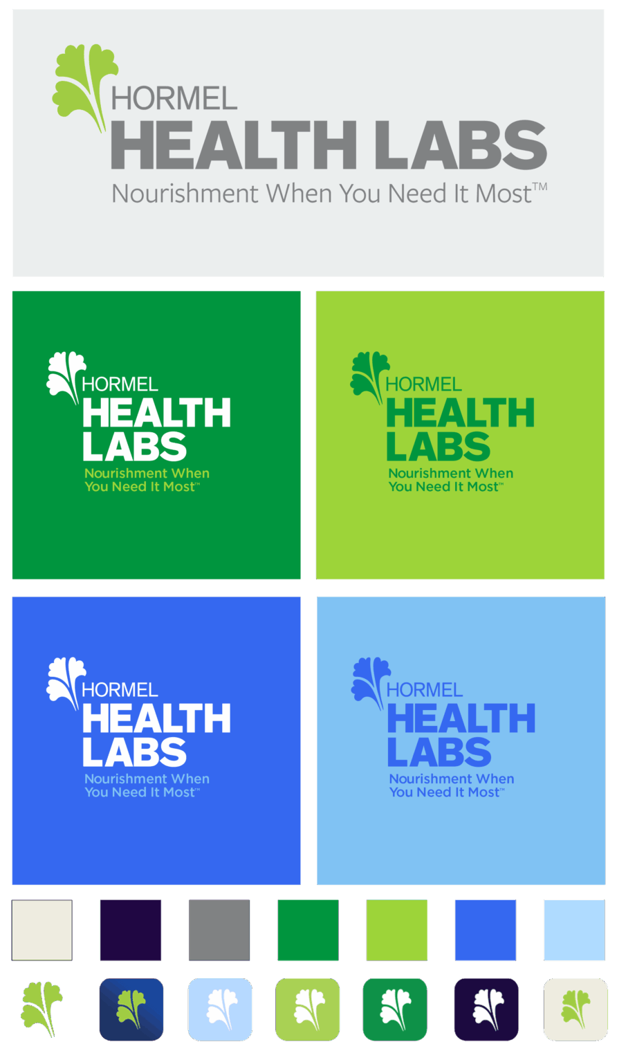
Implement a new brand color scheme as part of a larger design system project

RESULTS
THE REDESIGN ALLOWED
- Collaboration on a shared brand identity model to help with both design and business strategy
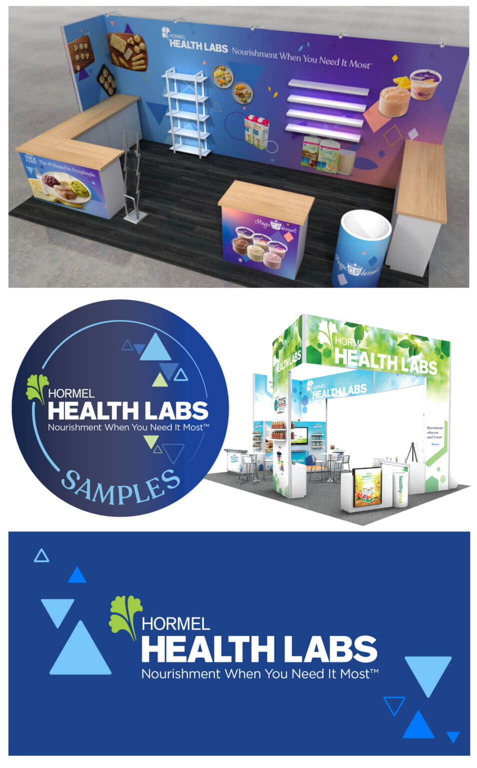
- Extension of the new brand into trade show booth designs — featuring the more attractive color palette
- Dialing up the “Health Labs” portion of the brand
- Continuation of using the parsley brand mark, reinforcing the relationship to the parent company
- Maintaining connection to the history of the company
- Greater flexibility for deploying the logo to different mediums in multiple orientations
- Development of a new tag line for use with all marketing collateral, which we also developed as part of the branding exercise
